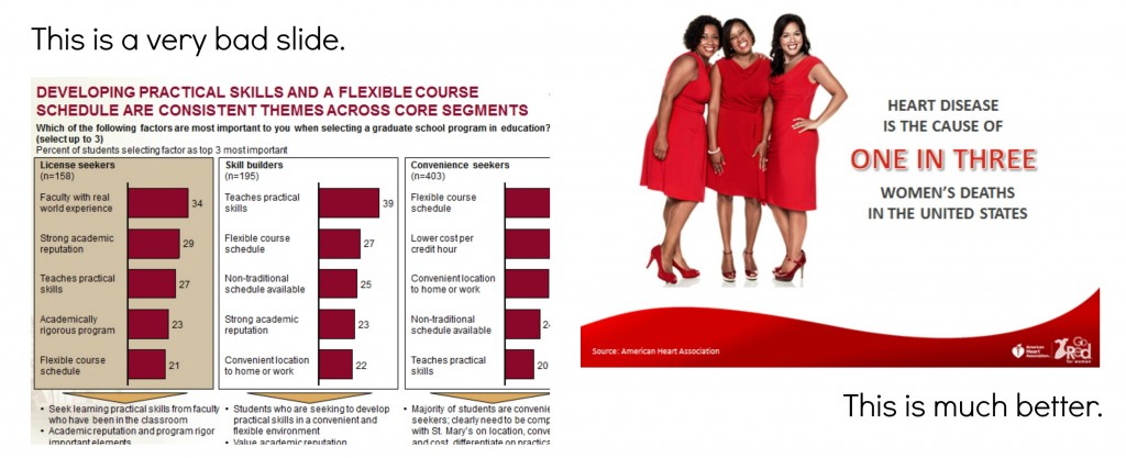
PowerPoint is at once beloved and beleaguered, but I think PowerPoint is either “good” or “bad” depending on the person using it. It can work for you, but you have to know what you are doing. (For a humorous example, check out this redesign of the infamous NSA slides.)

These are some of my design rules and guidelines for good — or at least not bad — PowerPoints.
- Design and write to meet your objective (don’t get distracted by other worthy but not on-message topics).
- A slide with just one image is a great slide.
- Text should be as short as possible. Aim for no more than 6 words.
- Titles should be two or three words, max.
- Use a mix of text, images, and charts to guard against monotony.
- Make sure the text is not too big – it appears to scream at your audience. (Remember it will be projected so it will look way bigger than it appears while you’re working on it on your desktop.)
- Titles, text areas, and images should not appear to fly around as you advance the slides. Use the “size and position” controls to make sure they are in the same place on every slide.
- If you use photos, make sure they are of the same size, shape, and quality, or do some design tricks in Photoshop (or a free program like PicMonkey) to make it appear that way.
- If you are discussing numbers or money, find a way to graphically represent it. Sometimes even just putting a few words of text into a table helps.
- There’s a time and a place for clip art. If it works for your audience and objective, it can adds some humor.
- Use font, bold, icon, color, or other cues to help your audience understand what they are seeing and how it relates to your objectives.
- Use animation only when necessary and then only use the simple “appear” – all other animations are gratuitous.
- I personally don’t like “thank you!” slides at the end of presentations. Better to just say it.
See this Slideshare for more inspiration for amazing slides!